Role
UX researcher, interaction designer, and visual designer
INFO360 FINAL PROJECT | GAN LUO | TEAM 23
A UX case study for an AI-assisted sports card price checker that helps collectors and small sellers identify cards, compare recent sales, and make clearer buying or selling decisions.
UX researcher, interaction designer, and visual designer
Semester-long UX process from research to prototype evaluation
Figma, user interviews, competitive research, testing notes, and feedback
Academic UX case study for a sports card marketplace app
01 / Problem
Sports trading card collectors often face uncertainty when deciding whether to buy a card. A listing may show the card image and price, but it may not clearly explain the card's value, recent market movement, or seller reliability.
This can be especially difficult for newer collectors. They may not know if a card is fairly priced, whether similar cards recently sold for less, or whether the seller has a trustworthy history. Many existing platforms focus on listing and selling cards, but they do not always help users understand the reasoning behind a purchase decision.
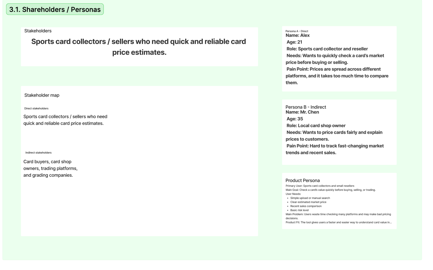
Newer collectors, casual buyers, and collectors entering a new sport or card set are most affected because they may not have enough experience to judge value quickly.
Trading cards can involve meaningful financial and emotional value. A poor purchase decision can lead to wasted money, frustration, and lower trust in online collecting communities.
Many marketplaces separate the listing from the evidence behind the listing. Users may need to leave the platform to check past sales, compare prices, or understand seller credibility.
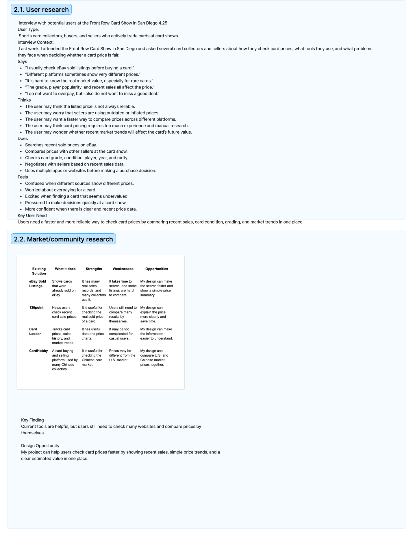
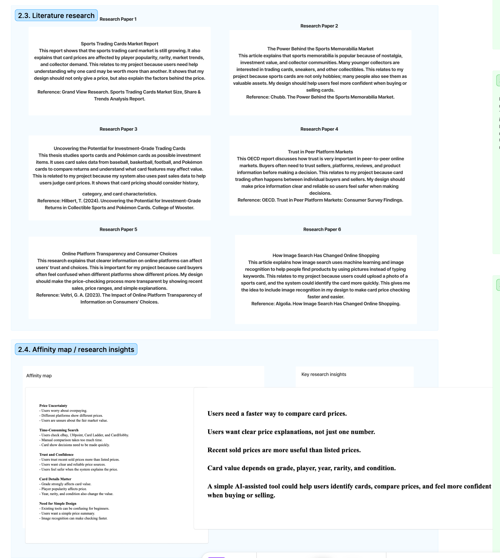
The problem direction was informed by interviews at the Front Row Card Show in San Diego, competitive analysis, literature research, and feedback from users who wanted clearer price signals.
In user research, collectors and sellers said they often check eBay sold listings, compare prices across multiple platforms, and worry about overpaying. A key user need was a faster and more reliable way to compare recent sales, card condition, grading, and market trends in one place.
02 / Evaluation
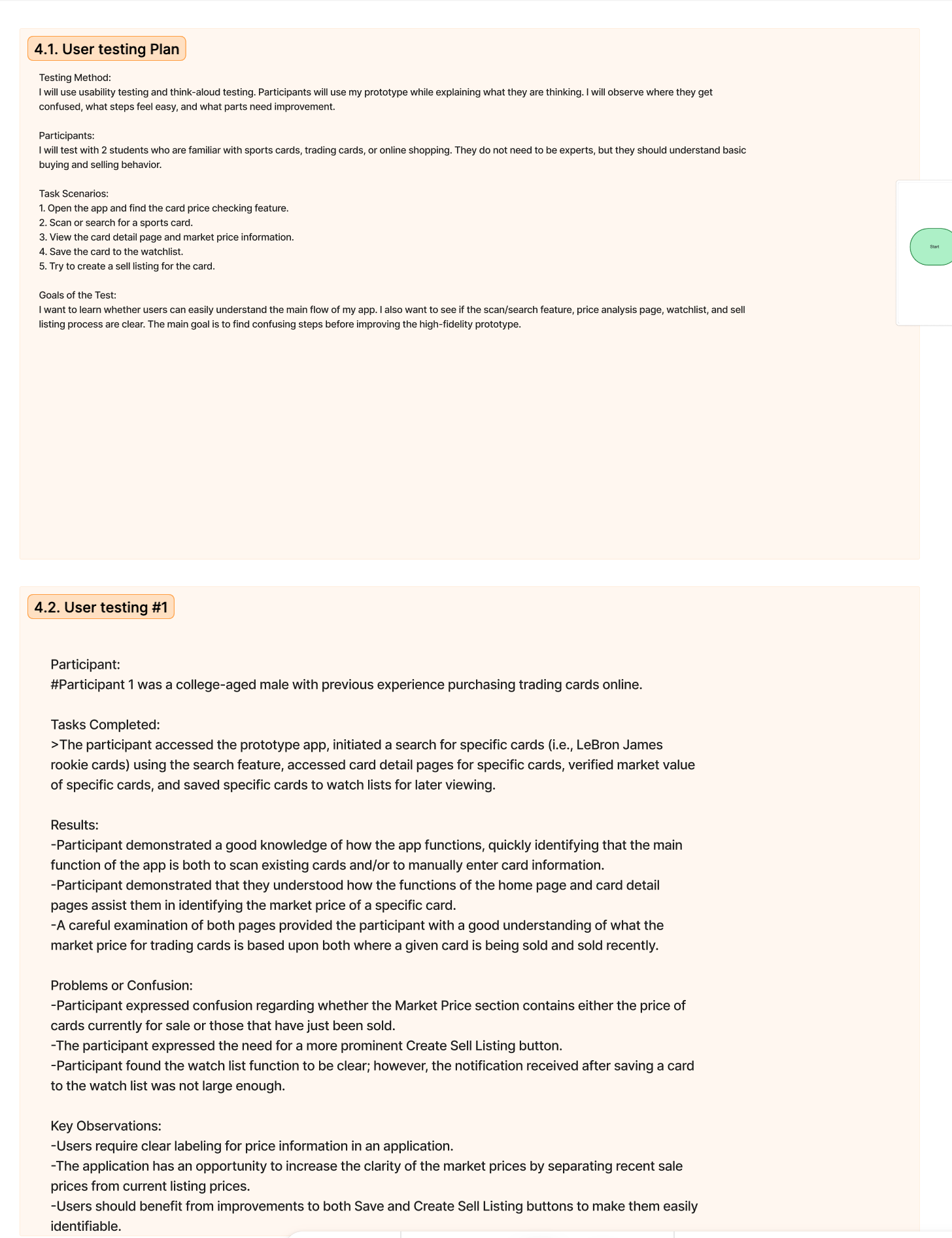
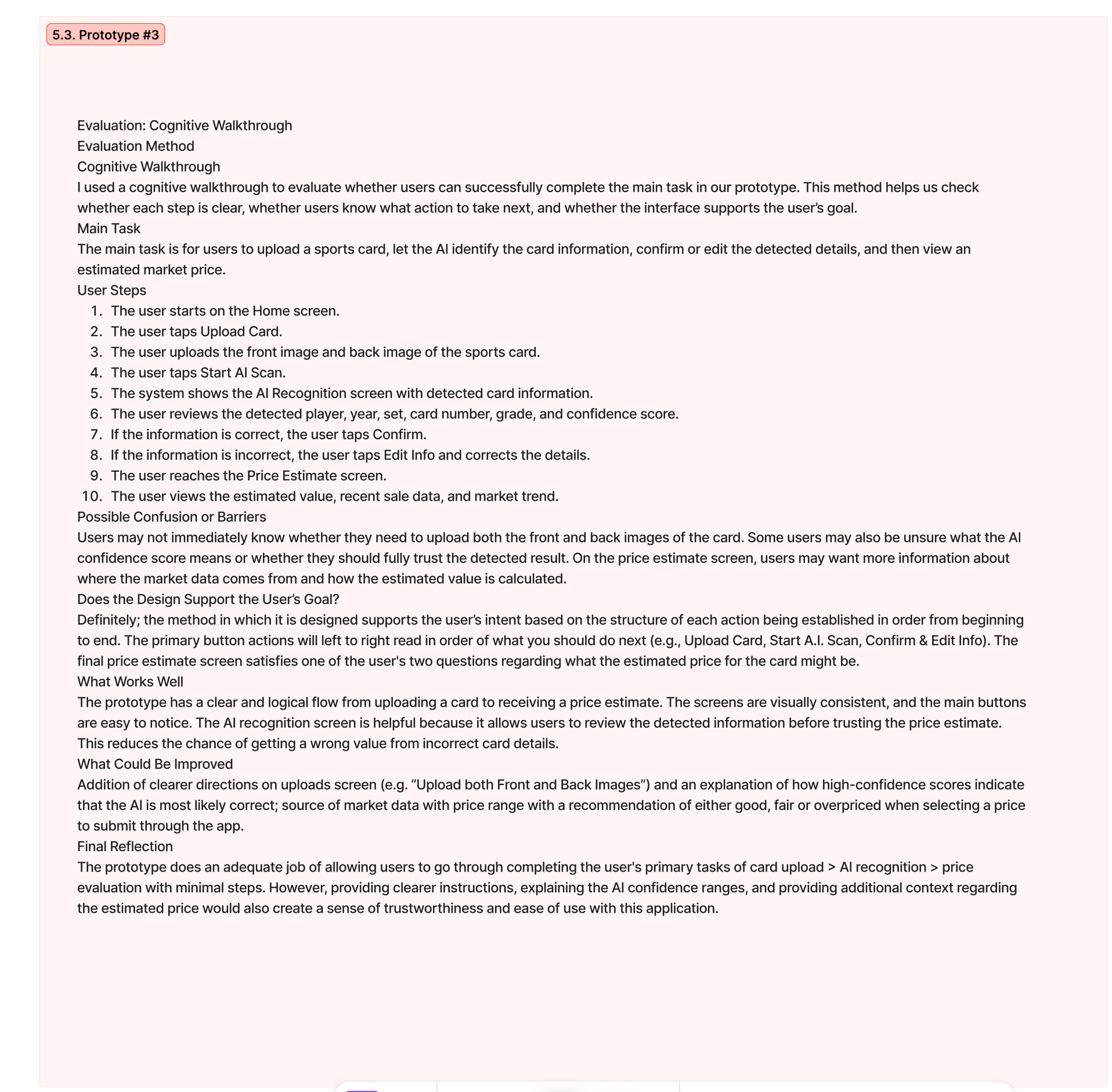
I evaluated the prototype through usability testing, a cognitive walkthrough, heuristic review, and informal user feedback. The goal was to learn whether users could understand the card details, compare market information, review seller credibility, and decide whether they felt comfortable buying.
Can users move from search to purchase decision while understanding price risk and seller trust?
Users should complete core tasks without confusion, explain what influenced their decision, and identify whether a card seems fairly priced.
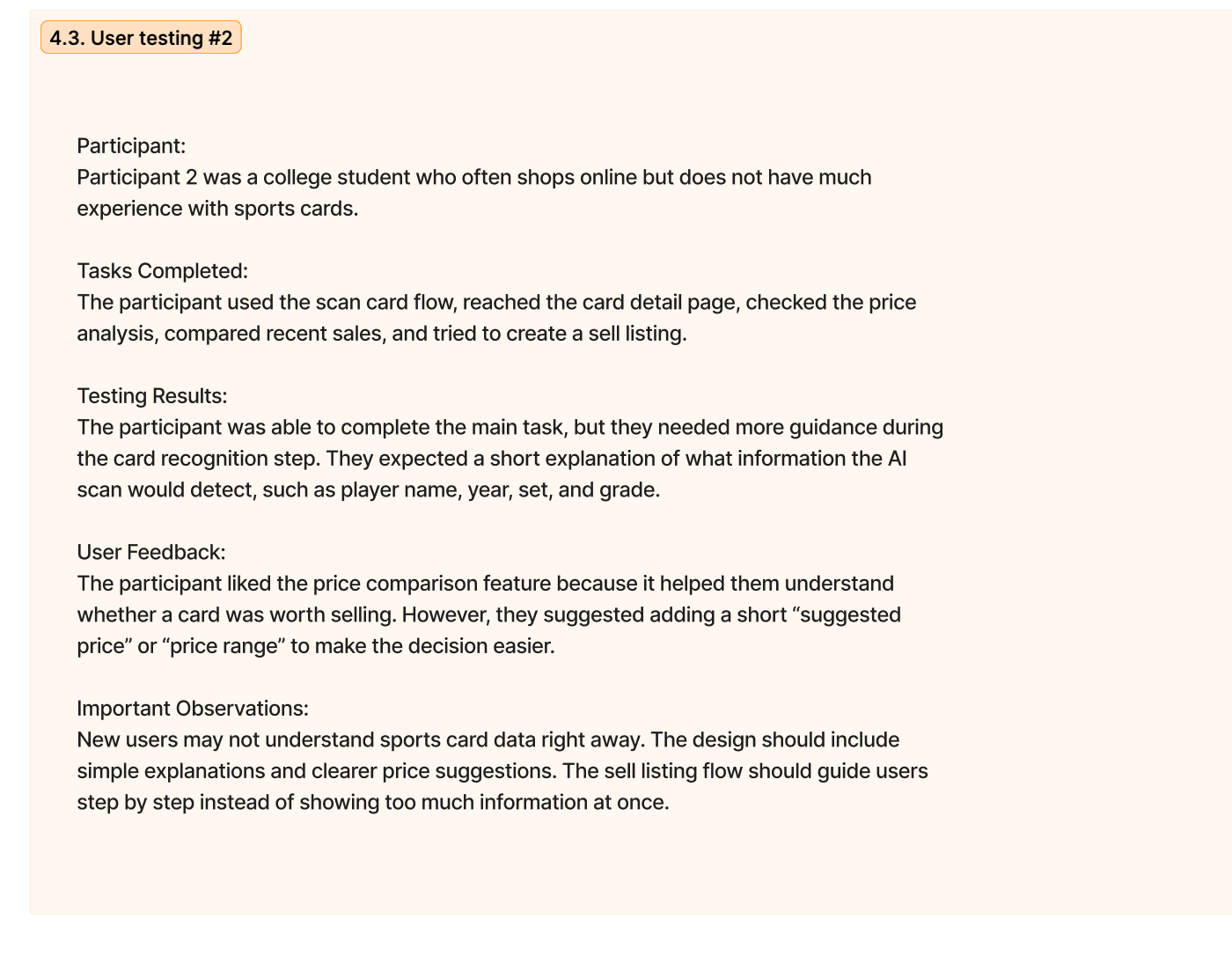
I tested with two students. One participant had previous experience purchasing trading cards online, while the other often shops online but had limited sports card experience.
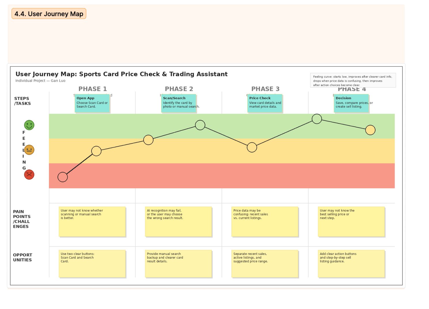
Users opened the app, found the price checking feature, scanned or searched for a card, reviewed card details and market price information, saved a card to a watchlist, and tried to create a sell listing.
Users understood that the app could scan cards or let them manually enter card information. They also understood the overall flow from card recognition to price estimate.
Users were unsure whether market price meant current listing prices or recent sold prices. One user wanted clearer guidance during AI recognition, and another wanted a more visible sell listing button.
Evaluation showed that the app should separate recent sold prices from active listings, explain AI confidence, and make save/rescan/sell actions easier to notice.
The evaluation combined usability testing, cognitive walkthrough notes, heuristic evaluation, and feedback collected after task completion.
03 / Design Rationale
CardLogic includes card information, market trend data, seller credibility, and a clear purchase decision flow because these are the areas where collectors often need support. Instead of forcing users to search across multiple sources, the design brings the most relevant decision-making information into one organized view.
Visual hierarchy was important because too much data can make the app feel intimidating. The design gives priority to the card name, condition, current price, recent trend, and seller credibility. More detailed information can still be available, but it should not overwhelm the first screen.
One trade-off was choosing simplicity over showing every possible market detail at once. A sports card market can include many variables, but the prototype focuses on the information most useful for a first purchase decision.
04 / Design Solution
The solution is a mobile marketplace experience that helps users move from search to comparison to purchase decision with more context and less guesswork.
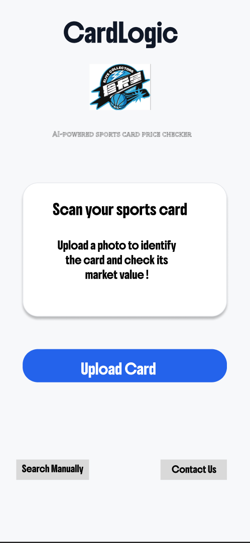
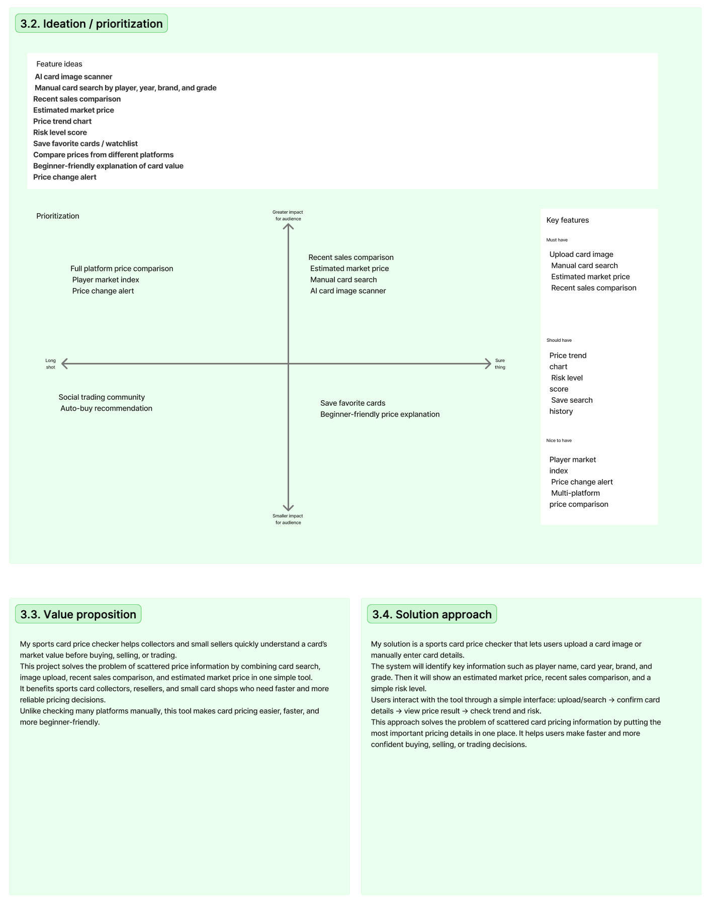
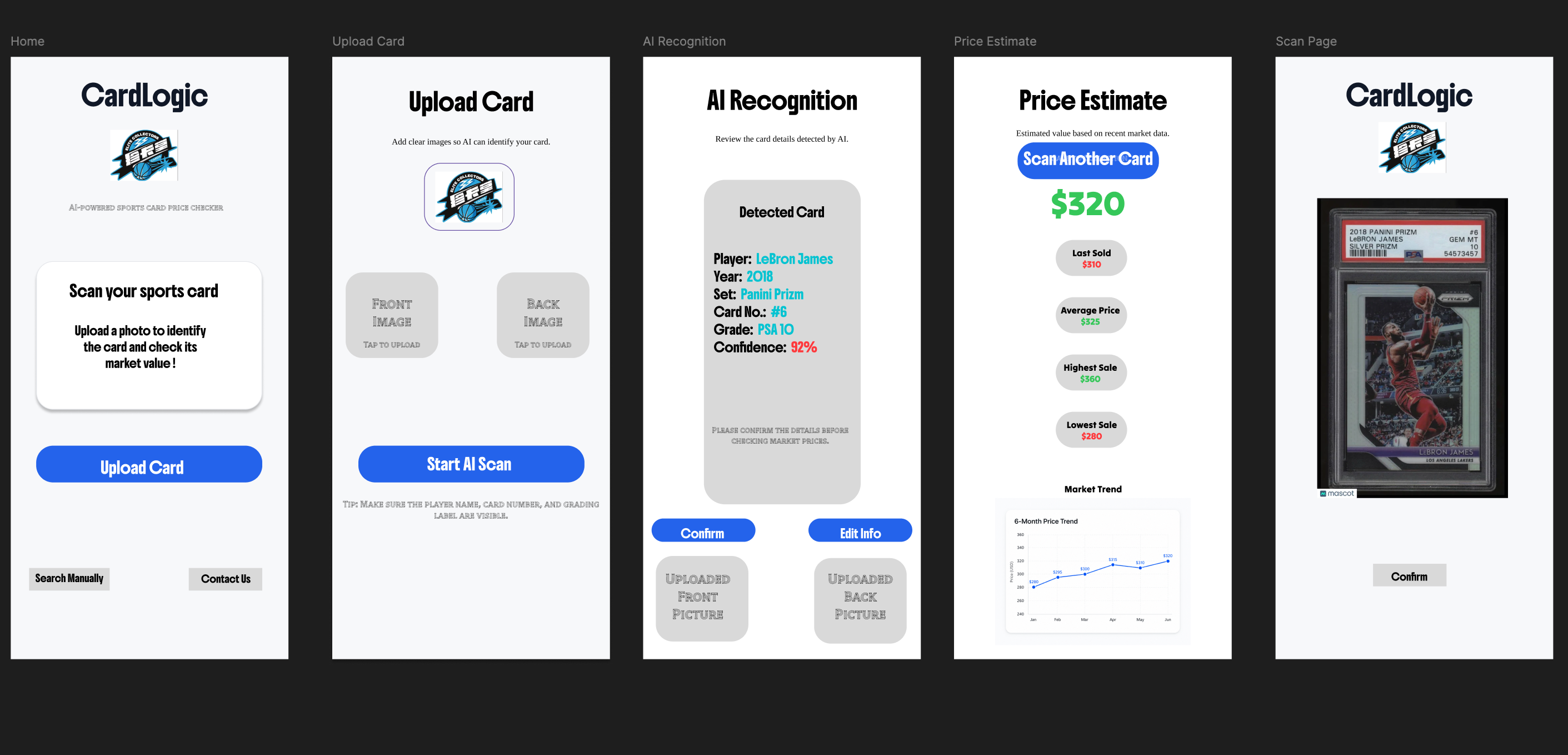
Users can upload a card image or manually search by player, year, brand, and grade.
The system identifies player name, year, set, card number, grade, and confidence score for user confirmation.
Users see an estimated value plus recent sale data such as last sold, average price, highest sale, and lowest sale.
A simple chart helps users understand whether the card value is rising, falling, or staying stable.
Users can save cards for later and move toward creating a sell listing after checking the estimate.
CardLogic connects card identification, recent sales, price explanation, and action choices in one flow. Instead of asking users to check several platforms manually, it gives them a focused summary for deciding whether to buy, sell, save, or compare a sports card.
05 / Reflection & Learning
This project helped me understand that UX design is not only about how an interface looks. The more important challenge is understanding what users need, where they feel uncertain, and how the design can support their decisions.
Moving from problem definition to prototype made me think carefully about each design choice. I learned that a feature should have a clear purpose, and that feedback can change the direction of a design in useful ways.
Evaluation was especially valuable because it showed gaps that were not obvious while I was designing. User feedback helped me improve labels, simplify information, and think more clearly about trust, scanning errors, and the need for clearer next steps.
I learned to move from a broad problem to a more specific user need, then test whether the design actually supported that need.
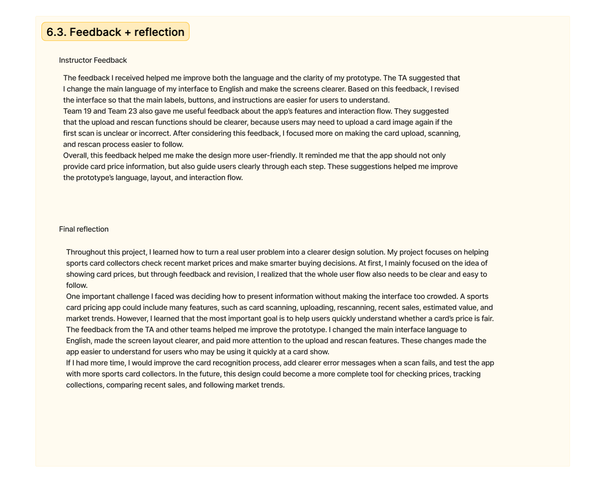
The hardest part was deciding how to present price information without making the interface too crowded. Card pricing can include scanning, rescan, recent sales, estimated value, market trends, and listing actions.
At first, I focused mostly on showing card prices. After feedback, I realized the whole user flow also needed to be clearer, especially the upload, rescan, and price explanation steps.
With more time, I would improve the recognition process, add clearer error messages when scanning fails, test with more collectors, and add stronger explanations for price ranges.
06 / Limitations & Future Plan
07 / References
These references come from the research notes used in the project. They should be checked and finalized in the citation style required by the course before submission.